Colour plays a silent but powerful role in every digital experience. From websites to mobile apps, every shade influences how users feel, interact, and trust a product. Designers often begin their journey with simple tools like Colour picker google, mainly because it offers instant access without installation or learning curve. It is fast, convenient, and useful for quick color identification.
However, as design projects grow into professional systems involving branding, UI/UX, and marketing consistency, the limitations of basic tools become more visible. Designers need more structured workflows, better palette generation, accessibility validation, and cross-platform accuracy.
This is why free alternatives to Colour picker google have become essential in modern design ecosystems. They allow creators to move from simple selection to strategic color system building.
Why Designers Start With Colour picker google But Move Beyond It
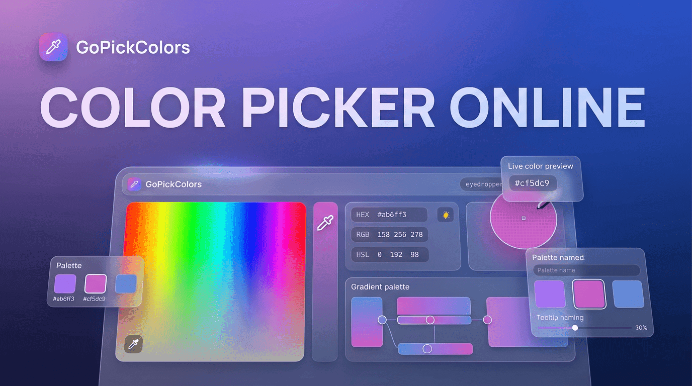
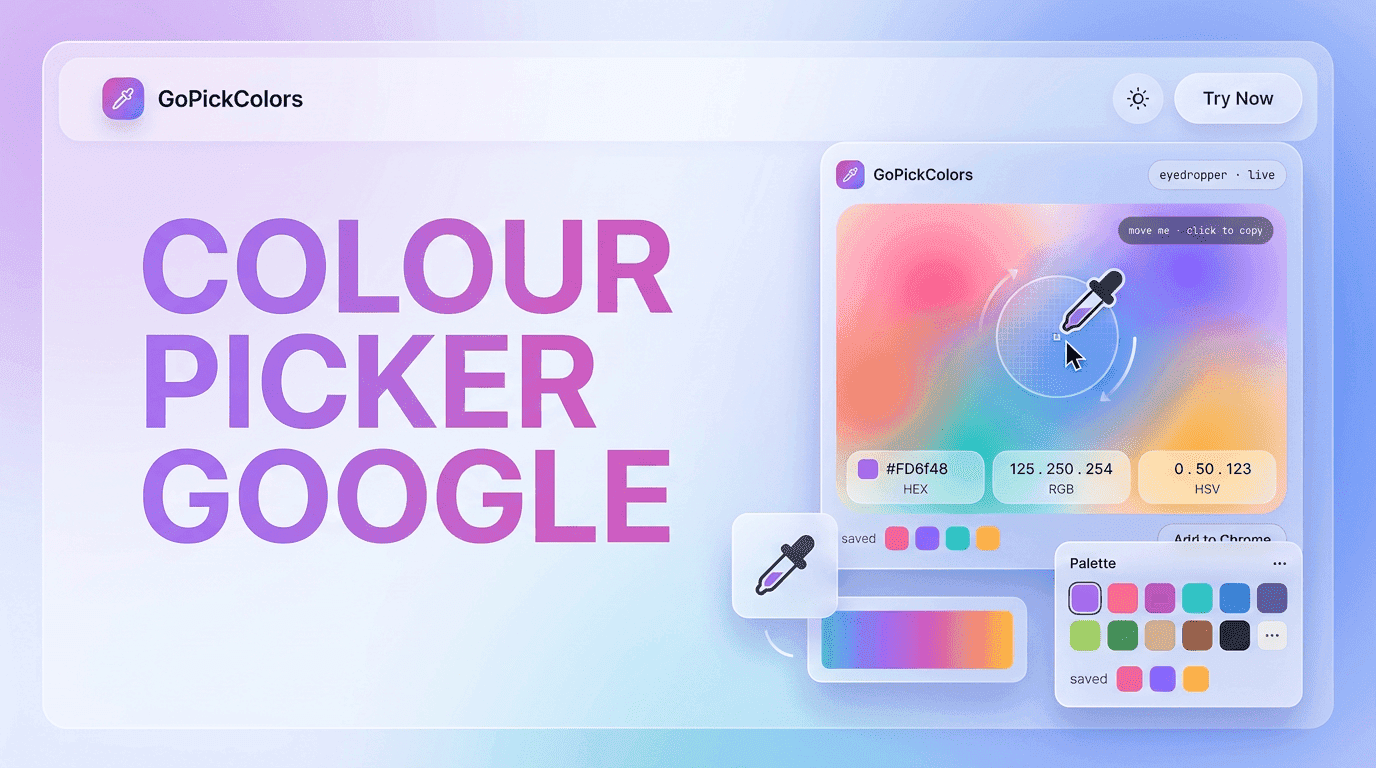
The first interaction most beginners have with digital color tools is through Colour picker google. It is widely used because it is simple just search, pick, and copy a HEX code. This makes it perfect for quick experiments, learning color codes, or identifying shades from web pages.
But professional design requires more than identification. Designers need structured systems that ensure consistency across multiple screens and platforms. While Colour picker google is helpful in the discovery phase, it does not provide deeper features like palette generation, contrast checking, or branding logic.
As projects scale, designers gradually shift toward advanced tools that support full design workflows instead of single-function tasks.
Best Free Alternatives to Colour picker google
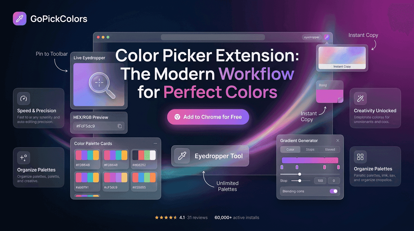
There are several powerful tools that offer far more flexibility and creative control compared to Colour picker google. These tools are designed to support real-world design systems rather than just color picking.
| Tool Name | Primary Function | Strength | Ideal For |
|---|---|---|---|
| ColorZilla | Web-based eye dropper | Instant page color extraction | UI designers & developers |
| Adobe Color | AI palette generator | Color harmony rules | Branding & identity design |
| Coolors | Fast palette creation | Instant generation system | Rapid ideation & inspiration |
| Canva Color Tools | Image-based palette extraction | Easy creative workflow | Content creators & marketers |
| Figma Color Styles | Design system integration | Scalable UI consistency | Product/UI designers |
Unlike Colour picker google, these tools do not stop at identifying a color. They help designers build full visual systems that can be reused, scaled, and maintained across multiple projects.
Each tool plays a specific role in a modern design workflow, making them more suitable for production-level work.
How Designers Use Colour Tools in Real Workflow Systems
In real-world projects, designers do not depend on a single tool. Instead, they follow a layered workflow that ensures accuracy, creativity, and consistency at every stage.
A typical professional workflow looks like this:
- Start inspiration gathering using Colour picker google
- Extract base colors from websites or images
- Generate structured palettes using Coolors or Adobe Color
- Validate accessibility contrast ratios for readability
- Apply final colors in Figma or Canva systems
- Cross-check consistency across devices and screen sizes
This structured approach ensures that Colour picker google remains a reference tool rather than a production dependency.
By combining multiple tools, designers avoid randomness and create predictable, scalable design systems.
Key Advantages of Free Alternatives Over Colour picker google
The difference between basic tools and advanced alternatives becomes clearer when we compare functionality. While Colour picker google is excellent for quick use, it lacks depth in professional workflows.
Feature Comparison
| Feature | Colour picker google | Advanced Alternatives |
|---|---|---|
| Color Extraction | Basic HEX picking | Advanced image + web extraction |
| Palette Generation | Not available | AI-based or rule-based systems |
| Accessibility Check | Not available | Contrast ratio validation |
| Brand System Support | Limited | Fully structured design systems |
| Workflow Integration | Minimal | Figma, Adobe, Canva integration |
| Speed | Very fast | Fast but feature-rich |
| Learning Curve | Very low | Moderate |
From this comparison, it is clear that Colour picker google is best suited for quick reference, while alternatives are built for production-level design systems.
Common Mistakes Designers Make With Color Tools
Even with access to tools like Colour picker google, designers often make mistakes that reduce the effectiveness of their visual systems. One major issue is relying too heavily on a single tool without validating outputs in real environments.
Another common mistake is ignoring accessibility guidelines. Colors that look visually appealing may fail readability tests, especially for users with visual impairments. Many beginners also copy trending palettes without adapting them to brand identity, which leads to inconsistent design language.
Additionally, designers often fail to test colors across devices, resulting in mismatched experiences between mobile and desktop platforms. While Colour picker google is helpful for quick identification, it should never replace systematic validation.
Actionable Best Practices for Designers
To build strong and reliable color systems, designers must focus on structure, consistency, and validation. Below are practical steps that improve workflow efficiency and design quality.
-› Always validate colors on real devices and screens
-› Use at least two tools instead of relying on one system
-› Build reusable color palettes for brand consistency
-› Ensure WCAG accessibility compliance for readability
-› Use Colour picker google only for quick color reference
-› Maintain documentation of color usage in design systems
-› Test palettes in both light and dark modes
These practices ensure that color selection is not random but strategically aligned with usability and brand identity.
The Role of Colour picker google in Modern Design Workflows
Even though advanced tools exist, Colour picker google still holds value in the early stages of design exploration. It is often the first step where designers identify inspiration from existing websites, images, or brand visuals.
However, its role is limited to discovery. It does not replace structured design systems or professional-grade tools. Instead, it complements them by providing quick access to color references.
When used correctly alongside advanced platforms, Colour picker google becomes part of a larger ecosystem rather than a standalone solution.
Final Thoughts: Building a Smarter Color Workflow
Color is one of the most powerful elements in design because it directly influences perception, emotion, and usability. While Colour picker google is a useful starting point for beginners and quick tasks, it is not designed for full-scale professional workflows.
Modern designers rely on a combination of tools like Adobe Color, Coolors, ColorZilla, Canva, and Figma to build structured, scalable, and accessible color systems. Each tool contributes a different layer of value from inspiration to execution.
Ultimately, Colour picker google plays an important foundational role, but true design excellence comes from combining multiple tools, validating decisions, and maintaining consistency across every visual touchpoint.